Less和CSS的关系
CSS是描述性语言,我们想要让内容长什么样子,就在相应的选择器上写下相应的样式,而Less可能给我们的感觉是有编程味道的CSS,它带有类似计算,变量,函数,继承等这些编程所具有的特点,所有可能会给一开始接触到的程序员一种熟悉的感觉。
编译工具
我现在自己使用的LESS编译工具是Koala,当然,它也可以编译SASS,可以在windows或linux多个操作系统下运行。
安装后打开,你会看到这样一个界面: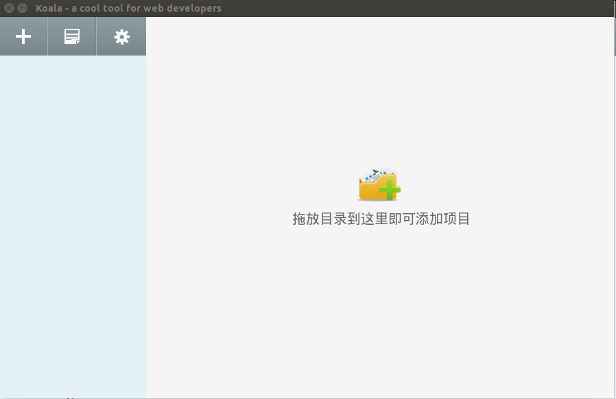
之后可以将项目拖到界面上,点击右键设置输出路径: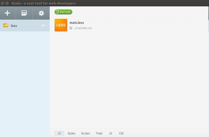
点击Less文件,在右侧边栏中勾选自动编译,选择编译方式以及输出方式,点击执行编译,若看到Success字样,即已成功编译。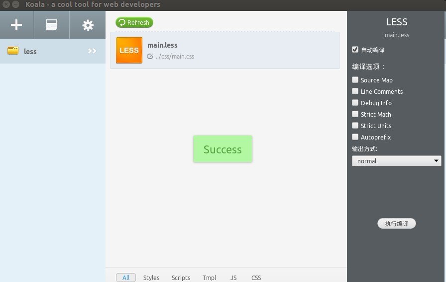
此时,你可以在Less文件中进行编写代码,保存时即会自行编译,在需要引用样式的页面中引进编译完成的CSS文件,路径为一开始设置的输出路径。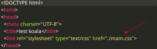
Less的简单运用
1. 变量1
2
3
4
5
6
7
8
9
10
11
12
13
14
15
16
17例如:
//简单的Less语句
@charset "utf-8";
@color: #ccc; //这里就是变量啦
@size: 14px;
body {
background-color: @color; //引用变量
font-size: @size;
}
//编译之后的CSS代码
@charset "utf-8";
body {
background-color: #cccccc;
font-size: 14px;
}
2. 混合
在一个class中引用另一个class,有点类似继承的感觉。1
2
3
4
5
6
7
8
9
10
11
12
13
14
15
16
17
18
19
20
21
22
23
24
25
26
27
28
29
30
31
32
33
34
35
36
37
38//Less代码
.border{
border: 1px solid #ddd;
}
.main {
width: 600px;
height: 500px;
.border; //引用了border类
}
//编译后的CSS代码
.border {
border: 1px solid #ddd;
}
.main {
width: 600px;
height: 500px;
border: 1px solid #ddd;
}
//带有参数的混合
.border_radius(@radius: 5px) {
border-radius: @radius;
}//该类编译后不出现
.main {
width: 600px;
height: 500px;
border: 3px solid #ddd;
.border_radius(40px); //改变了默认参数的值
}
//编译后的CSS代码
.main {
width: 600px;
height: 500px;
border: 3px solid #ddd;
border-radius: 40px;
}
3. 嵌套
嵌套可以减少多人合作时选择器命名相同的而以前的影响,同时,因为有了嵌套,我们可以少写很多选择器串。1
2
3
4
5
6
7
8
9
10
11
12
13
14
15
16
17
18
19
20
21
22
23
24
25
26
27
28
29
30
31
32
33
34
35
36
37
38
39
40
41//有html结构如下:
<div class="item">
<a></a>
<ul class="item-list"></ul>
</div>
//Less代码
.item{
width: 200px;
height: 100px;
a{
text-decoration: none;
color: #ccc;
&:hover { //&在这里表示a
text-decoration: underline;
color: #0ff;
}
}
&-list{ //&在这里表示.item
list-style: none;
padding: 5px;
}
}
//编译后的CSS代码
.item {
width: 200px;
height: 100px;
}
.item a {
text-decoration: none;
color: #ccc;
}
.item a:hover {
text-decoration: underline;
color: #0ff;
}
.item-list {
list-style: none;
padding: 5px;
}
4. 匹配模式1
2
3
4
5
6
7
8
9
10
11
12
13
14
15
16
17
18
19
20
21
22
23
24
25
26
27
28
29
30
31
32
33
34
35
36
37
38
39
40
41
42
43
44
45//三角形的匹配模式(朝哪个方向)
//上
.triangle(top,@w:5px,@c:#ccc){
border-width: @w;
border-color: transparent transparent @c transparent;
border-style: dashed dashed solid dashed;
}
//下
.triangle(bottom,@w:5px,@c:#ccc){
border-width: @w;
border-color: @c transparent transparent transparent;
border-style: solid dashed dashed dashed;
}
//左
.triangle(left,@w:5px,@c:#ccc){
border-width: @w;
border-color: transparent @c transparent transparent;
border-style: dashed solid dashed dashed;
}
//右
.triangle(right,@w:5px,@c:#ccc){
border-width: @w;
border-color: transparent transparent transparent @c;
border-style: dashed dashed dashed solid;
}
//无论.triangle匹配到哪个模式都带下面的属性(@_)
.triangle(@_,@w:5px,@c:#ccc){
width: 0;
height: 0;
overflow: hidden;
}
//右三角
.right_triangle{
.triangle(right,100px,#000);
}
//编译后的CSS代码
.right_triangle {
border-width: 100px;
border-color: transparent transparent transparent #000000;
border-style: dashed dashed dashed solid;
width: 0;
height: 0;
overflow: hidden;
}
其他
还有一些类似计算,避免编译等其他语法这里就暂时不做介绍了,have a nice day!^_~